Mining through black metal for embarrassing covers seems to be a stable career as it’s a cavern pregnant with aesthetic missteps and artistic statements that scream, “Hey, Mom and Dad, this isn’t a phase.” Now we can argue that it’s the music that counts, and in a most cases that’s true, but we are a visual people, probably due to decades of training via marketing. Let’s use this example: if Coca-Cola got rid of Santa and polar bears at Christmas and just had pictures of old dicks all over the can, I’m pretty sure a lot of people wouldn’t purchase it regardless of it being the same old Coke on the inside.
At the rate things are progressing, they’re probably going to have to replace polar bears with something in the next few decades. How many companies use a fucking dodo as their mascot? Plenty, I’m sure, but you get the idea.
It also indicates that if you give this little of a shit about the optical presentation, then who is to say you cared about the music? If you truly just wanted your music to speak for you, then you’d just use a blank sleeve as the cover. Either way, it’s your vision I guess, go be a visionary.
I’ve left out demos and shit from the ’80s, mostly because that seemed unfair and otherwise you’d have to read 250 words on Goatlord’s Sodomize the Goat art. Christopher Moyen’s name came up numerous times when discussing this list, but his art is awesome. However, his many imitators are almost universally garbage and lack the master’s touch. You could have a coffee table book of shitty Thorncross mimics, so you have something to discuss the next time your PO stops by. Honestly, I don’t know how many variations of Jesus being raped we really need but it’s hilariously suspect in a corner of black metal that values testosterone and masculinity, the same people who get uncomfortable when I make too many dick jokes.
Ragnarok – Blackdoor Miracle

Ragnarok almost made the last list with their debut Nattferd, which is an underrated gem, but I think Blackdoor Miracle supersedes it in poor design choices. I guess this was around the time where bands who formerly pointed swords and axes at whatever friend they knew owned a camera and switched to guns, but I really don’t understand what’s happening on this cover. I guess he shot the girl who’s having ritual sex and I guess she’s supposed to represent strength of the will since she’s still writhing away while looking like a 50 Cent song. There’s a lot of orange, which I guess is supposed to be fire, but it looks more like someone left their Halloween cake in a car on a hot day and forgot about it. All I know is I can’t be intimidated, no matter how big the gun is, by a shirtless man in a leather vest covered in Kool-Aid. Their first three records are great, though I think I stopped paying attention once the orange to riff ratio got this high. Speaking of orange…
Dark Funeral – Diabolis Interium

Dark Funeral were important for a few reasons: they basically introduced the greater underground to VON, they had a member of Svartsyn, their first EP and full lengths are classic Swedish black metal. Somewhere around album two, they went from being evil as fuck black metal to leather daddies getting ready to hit the clubs. Before long they were the definition of “generic” and entering Abyss Studios didn’t help. But enough about how their music started to suck, let’s talk about this abortion of a cover. It was a difficult choice since the subsequent record was also a digital shitfest smeared like a five-year-old’s painting of how candy corn is made. I think the demon playing with his titties on the cover is supposed to be Ahriman but I guess that’s for him and his therapist to work out. This cover looks like the last thing a child sees painted on the interior roof of the van he was just thrown into.
Imperial Crystalline Entombment – Apocalyptic End in White

Buckethead should sue. This is more attention than this band has received in a decade.
Maniac Butcher – Lucan Antikrist

Maniac Butcher could have had nearly any of their record covers on here as they are all uniquely terrible, and the more sensitive out there could do a few think pieces on their less-than-progressive views, but I chose this cover because it reminds me when I was a child and I used to make collages using paste and images I cut out of magazines — mostly Star Wars if you must know — and I think they applied the same technique here. One could argue that it’s even akin to William Burroughs conceptual “cut up” technique and maybe I just can’t grasp this high concept and thus am condemned to lower academic circles. Or it could just be a guy pasted on a horse pasted on a fucking Halloween card. Still, check out “Invaze” for some great dirty old black metal.
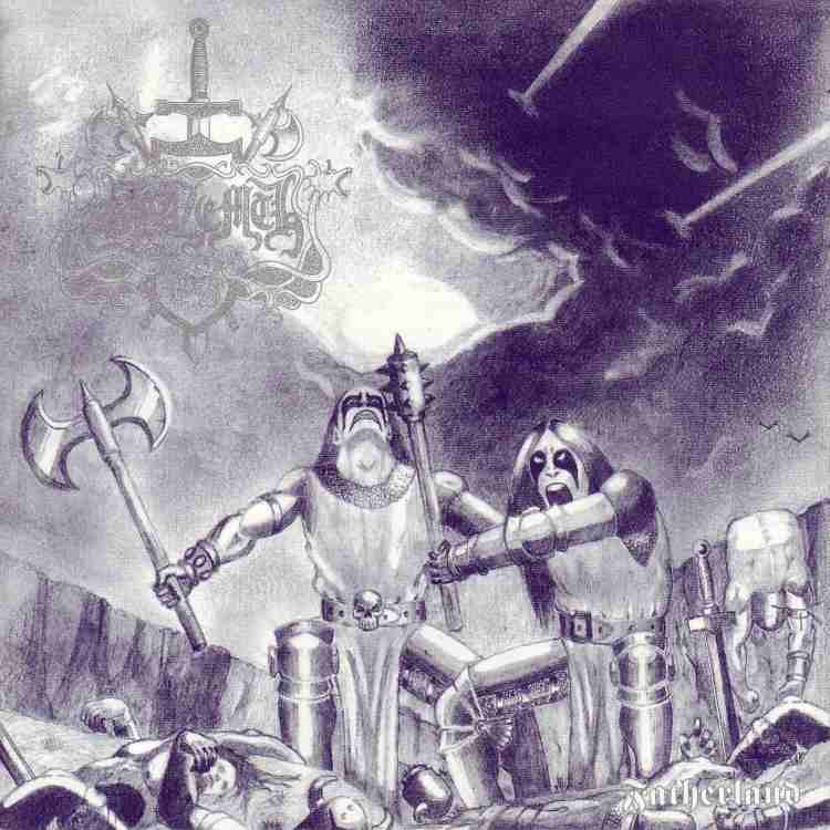
Blazemth – Fatherland
 Is that half man doing a hand stand?
I understand that a lot of bands don’t have a massive art budget, but I’m not convinced that you should have used the first draft of a concept drawing as the finished product. Also, I’m not an art teacher but the hairlines are suspect and I still have no idea if that half a man is floating, doing a handstand or supposed to be dead hanging off the cliff that, in my perspective, is far away. Maybe he’s a giant? Holy shit, they killed a giant without their makeup smearing! I can’t even go outside on a humid day without my eye liner dripping. Also Metal-Archives claims they’re active again so I’m curious to see how their sound developed in the 20 years since they departed and if they still have the aesthetic tastes of a 12-year-old who just discovered tits and Dragonlance. Their recordings are totally worth a listen if you can ignore the cover.
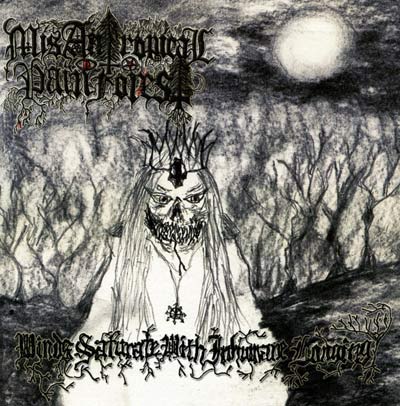
Misantropical Painforest – Winds Saturate with Inhumane Longing
 I’m sure he’s saying “BOO!”
I believe we all can accept that Finland is, from outside perspectives, an intensely weird place but this falls off from being adorably strange to asinine, mostly because the name always irritated the fuck out of me. But I’m not here to judge the project’s name or music, (otherwise I’d actually have to listen to it) and boy, what can be said about the cover? It looks like a police sketch drawn by Ray Charles of the description given by a small child of the monster that represents every time Daddy has a few too many Manhattans and starts waving his gun around at Mommy. I could be projecting, honestly, who knows anymore? Just know that this, like the rest of these covers, was approved to represent the music within the release.
And again, in the spirit of giving that comes with this season of June, I’ll throw you a terrible cover of something I was involved in.

Now I didn’t create this or have anything creative to do with this project. But I am singing on this and I’m singing about science, like Bill Nye kind of shit that makes no sense. I agreed to be on this of my own free will even if the cover looks like it was made for a video game developed in one of those colleges that used to advertise at 3am about getting your career in gaming started. That weight is mine to carry, a space Sisyphus if you will, which I hope you don’t.


