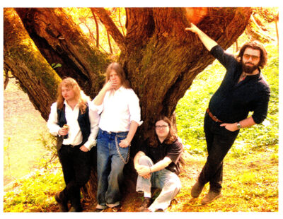
Caroline Harrison is an artist who sometimes photographs for online music publications. Follow her on Instagram and Twitter. Listen to The Mother Of Virtues and learn more about Pyrrhon.
Please double click on the images below to enlarge.
—
I’ve been the sole visual artist that Pyrrhon has worked with during the nearly six years they’ve been together. We understand each other’s aesthetic sensibilities, and we know a bit about each other’s creative processes. We trust each other.
When I’m working on a project for them, I look to the lyrics for inspiration. An early version of their song “Balkanized” appeared on a 2012 demo. The lyrics discuss two men who have never met but will one day face each other in battle. So for the demo cover I drew two decaying rats lying in a circle, each eating the other’s tail in a posture recalling an ouroboros, a circular symbol in which a snake eats its own tail. The ouroboros is often interpreted as representing the cyclical nature of reality. The rats eating each other were an easy way to talk about violence.
Pyrrhon didn’t come to me with any specific ideas for the demo cover other than “make it … cool? And gross?” But they had a specific vision for The Mother Of Virtues. They were interested in an archetypal religious image centered on a pregnant woman since they’d settled on the name The Mother Of Virtues. A ton of time and effort was put into the lyrics, so they were also interested in showcasing them with a single illustration per song in the liner notes. For Pyrrhon’s debut LP, An Excellent Servant But A Terrible Master, they’d come to me with the idea that the cover should adhere to a mandala-like radial structure. I carried that through for the demo cover, and so the band was interested in pursuing it for The Mother of Virtues as well.
In Sanskrit, “mandala” just means “circle.” In English, the word “mandala” refers to circular symbols that have a sort of spiritual significance. They’re primarily found in Hinduism and Buddhism. Even some Christian imagery relies on a similar radial pattern – think about rose windows in cathedrals, or Celtic crosses, or certain medieval illuminated manuscripts. Carl Jung incorporated the drawing and interpretation of mandalas into his psychotherapy practice. Both the band and I gravitate towards this structure because of the metaphorical symbolism, but also because the radial patterning can be disorienting and psychedelic.
The band provided me with a basic skeleton for the art; the musculature and flesh were left up to me. I kept them involved by showing them pieces as they progressed and by bouncing ideas off of them, but they gave me a lot of freedom. I’m grateful for that.
When starting a piece, I usually draw out a few rough thumbnails, or small sketches. They’re like visual notes that record your idea, and mine often look incredibly crude. I also spend a lot of time in my sketchbook drawing studies of images I intend to use (see above). Google images is invaluable in finding reference images of textures or forms — I can’t count the number of cockroach pictures I looked at, or the number of image searches I did for different types of tumors. One search led to another: tumors caused by echinococcus multilocularis (a type of tapeworm) in rats were a beautiful and translucent pale yellow, punctuated by red arteries. The cancerous growth on a smoker’s neck was at once horrifying and arresting, both vividly pink and red. I filled pages with different ways of rendering colors and shapes.
—
I hover in a weird in-between space between a painter and a draftsperson (fancy word for someone who draws, just don’t call us “drawers”), so for the album cover I used different media. There’s gouache (basically an opaque sort of watercolor), watercolor, and ink. The pigment in the gouache kept clogging my pens, so I have a few pages in my sketchbook of meaningless scribbles left over from trying to clear the felt tips on my Micron pens, favored by many artists because they draw smooth, clean lines. I didn’t ever come up with a perfect solution to this problem, but I did find that applying a layer of fixative helped a bit since it sealed some of the pigment.
Every artist works differently. I tend to start with a general outline of what I want, but I experiment, and I see where things take me. I give into impulses. What some people might consider accidents or fuck-ups, I consider opportunities. This isn’t because of any sort of happy go-lucky worldview – anyone who knows me would laugh at the notion that I face challenges with a smile and a song. Rather, I’ve learned to recognize the value of these glitches. They force me to consider what I’m doing and figure out how to incorporate imperfections in the end product. There’s beauty in imperfection.
During this process I checked in with the band. They made suggestions, and I would either listen and incorporate their ideas, or talk about why I didn’t agree. Sometimes they refrained from making comments. I would often layer new elements in, or add huge fields of color, so they knew that the next time they saw the art it would look very different. They would make the choice to trust me and wait and see what I did. But keeping the band involved was crucial. They had to feel like the art represented the music. The art needed to evoke the feelings of chaos, disgust, helplessness, and horror that the album embodies.


