Heavy metal fathers Black Sabbath are in the midst of their final tour. The records will always be with us, of course, but the thought of a world without an active Black Sabbath is nonetheless sad. In honor of Sabbath’s final trek around the globe, we are running our 2014 print feature on the story behind the cover art of Sabbath Bloody Sabbath, which was illustrated four decades ago by a rising Los Angeles artist named Drew Struzan. The article features Struzan’s most comprehensive interview on the Sabbath art. Struzan later became famous as the poster artist for the Star Wars and Indiana Jones franchises.
Here is the original dB feature Killing Yourself To Live: The Story Behind The Art of Sabbath Bloody Sabbath from issue 118 in August 2014.
—
By Justin M. Norton
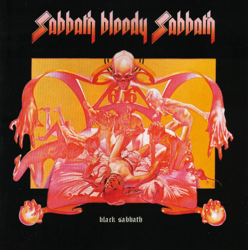
In 1973, Drew Struzan was a 27-year-old illustrator and the sole artist for the Pacific Eye & Ear agency on La Cienega Boulevard in Hollywood. He cranked out artwork on deadline in an office amidst a few salespeople and an accountant. He received a simple request for a Black Sabbath album cover: draw a picture of a dying man. Struzan realized he might be able to make it into something more: what if the front image depicted an evil man dying and the back depicted a good man’s last moments?
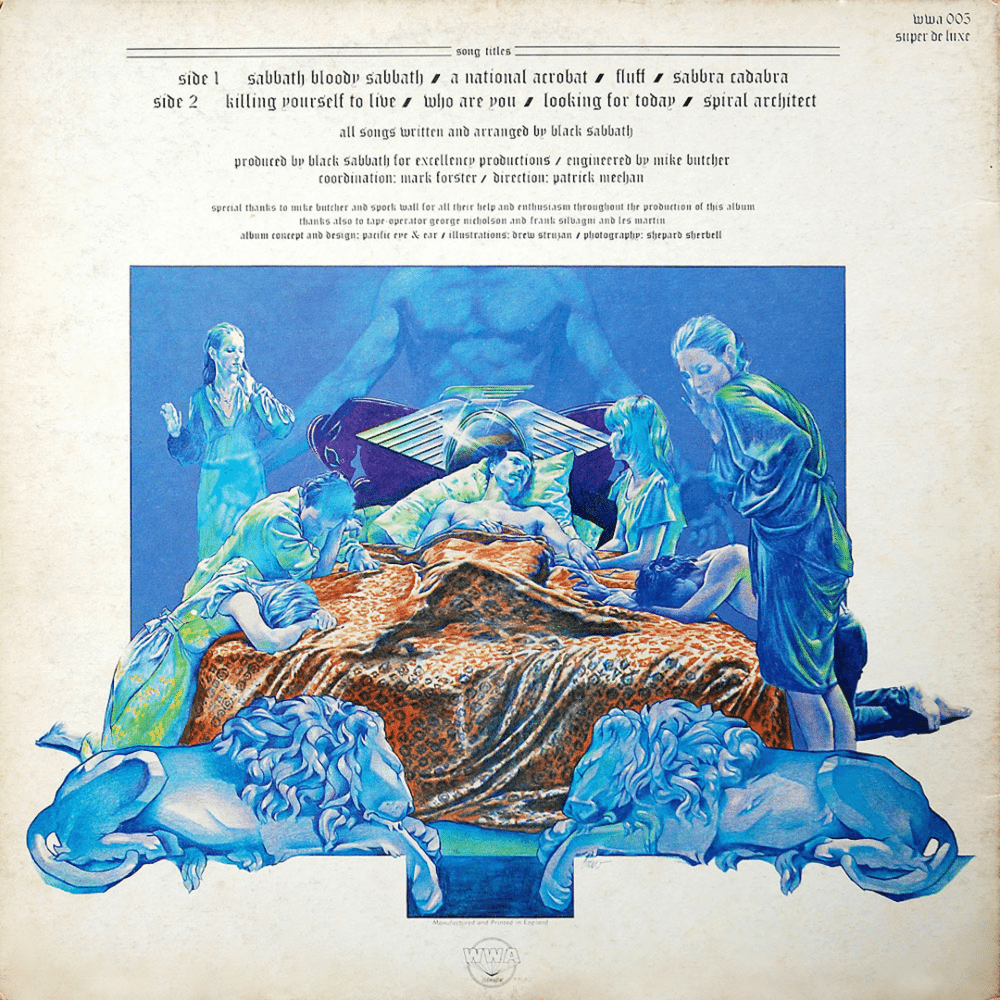
The resulting images, drawn with colored pencils on a white illustration board with guidance from creative director Ernie Cefalu, are the iconic album art of Black Sabbath’s fifth record Sabbath Bloody Sabbath. The illustrations— one on the front cover and one on the back — have been seen around the world on posters, tee-shirts, stickers, patches and tattoos. While the artwork perfectly encapsulates the essence of Black Sabbath – malevolence at war with man’s angelic nature — Struzan didn’t hear the record until it was played in his design shop after he finished the project. The fact that the images mesh effortlessly with Sabbath’s music was serendipitous.
“I know it will break people’s hearts but it was just another assignment,” says Struzan, who later rose to fame illustrating posters for the Star Wars and Indiana Jones franchises as well as the recent Hellboy films. “I wasn’t participating in a lot that was going on around me and this was my means to make a living. I was just a hungry little kid – the employee illustrator – and they gave me this cover 40 years ago. It just came to my table.”
Fortunately for the Sabs and their fans, Struzan was in a period of personal exploration when he started work on the art. Sabbath’s earlier album art perfectly captured the band’s developing aesthetic: the foreboding doom of the nameless woman on a fall day on the eponymous debut; the stark black and purple lettering of Master Of Reality and the Hollywood excess of Volume 4. The only exception was Paranoid. The album was slated to be called War Pigs and when the title changed the photo of a sword–wielding madman seemed incongruous.
Sabbath Bloody Sabbath depicted the Manichean struggles of the soul — something that wasn’t completely foreign to the band as drugs, fame and fights threatened to derail their career. Struzan didn’t come from a religious background but was reading Scripture and studying religion in the early 70s as part of a quest to “look for the purpose of life.” Many of the symbols in the two illustrations are taken directly from what he read. Struzan viewed dying as more of a gateway than an absolute end. Both the front and back covers show how death can lead to anguish and horror – or transcendence.
On the front cover – undoubtedly the more famous illustration — an evil man lies in torment on his bed surrounded by demons with webbed feet. The stark red colors and the 666 on the bedpost give the illustration a menacing feel. The back cover, depicting the death of a good man, is etched with blue overtones and shows mourners grieving at a bedside. It’s a peaceful exit rather than a gateway to eternal torment. “The (images) were opposites and I think it made it iconic,” Struzan says. “It was something a little open ended and the fact that it’s an open door to people’s feelings gives them a chance to connect.”
Decades later, Struzan doesn’t understand those who think the art is an endorsement of evil; it’s a stark reminder to be mindful of how you live. “I don’t think it’s a revelation that everyone dies. So I don’t worry about that (criticism),” he says. “When you search for truths you find out that there are lies and cruelty and death. If someone is worried about truth than they just need to grow up.” Part the problem might be that compact discs and digital downloads often only showcase the front image and not the back. A generation of listeners might have missed the art as it was meant to be seen.
Despite his work on famous film franchises and Alice Cooper’s Welcome To My Nightmare, Struzan says the Sabbath Bloody Sabbath still generates interest and questions. “As far as album covers go it’s no question that’s the one I hear the most about,” he says. “Maybe not as much as Star Wars but there are a lot more Star Wars incarnations and years between then. But if you do something well it’s not an illustration. It sets up a circumstance where (the art) can work its way into the heart.”
Struzan estimates he was paid $250 for the week of work it took to finish the Sabbath Bloody Sabbath art. He hasn’t been paid more despite millions of sales over four decades, but he occasionally receives thank you letters from Black Sabbath. He still views himself as nothing more than a working artist. “People get the impression that I get around and I’m part of the scene but the reward was just to have the work,” he says. “I do get feedback and 40 years later it makes me feel good.”
He doesn’t know where the original image is now. “The boss still owns it,” he says. “At the time it was for the check.”